Minnesota's new flag
Minnesota has been choosing a new state seal and flag. The current seal depicts a white settler ploughing the fields, gun propped against a tree stump, while an Indigenous figure rides on horseback:
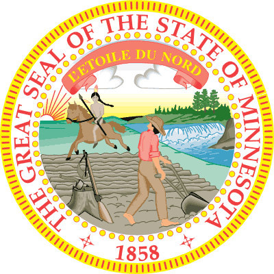
The seal originally showed the horse galloping into the sunset and the figure looking back sadly at the land that used to be theirs, but in the 1980s the state government tried to make the image seem less overtly about white supremacy by changing the horse to be trotting southwards, with the figure facing the white man. This change wasn’t entirely successful.
You might think I’m reading too much into the seal to think it’s about Manifest Destiny, but the designer’s wife wrote a poem to accompany it. It starts out:
Give way, give way young warrior,
Thou and they steed give way—
Rest not, though lingers on the hills,
The red sun’s parting ray.
The rocky bluff and prairie land
The white man claims them now,
The symbols of his course are here,
The rifle, axe and plough.
It doesn’t get much better later on:
The Red man’s course is onward—
Nor stayed his footsteps be,
Till by his rugged hunting ground
Beats the relentless sea!
We claim his noble heritage,
And Minnesota’s land
Must pass with all its untold wealth
To the white man’s grasping hand.
The basic message is for the indigenous population to head west until they get to the Pacific Ocean and can’t head west any further. (That probably wouldn’t have worked out too well, as Oregon was founded as a racist “whites only” utopia, but that’s another story.)
The current flag has the seal in the middle, then a ring of lady’s slipper flowers around it, then a ring with stars around that, and “MINNESOTA” written across the bottom, all in a garish combination of red, blue, green, pink and gold:
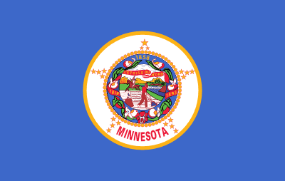
Even if you see nothing wrong with the seal, this pretty much fails as a flag, as it’s impossible to make out any of the details at a distance, particularly if it’s actually on a flagpole.
Anyway, in 2023 the state legislature decided it was time for Minnesota to have a less ugly and racist flag and seal, and there was a public contest to come up with ideas. The seal and flag submissions were all posted online. Obviously I had to go look through all of them.
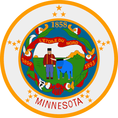
That one’s a variation on the current seal, replacing the racist part with Paul Bunyan and Babe the Blue Ox.
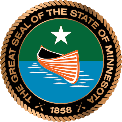
A canoe on a lake. Nobody in it, though, and no paddle, perhaps it wasn’t tied up?
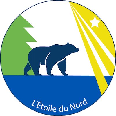
Yes, Minnesota has bears, but I think California has a lock on the bear thing.
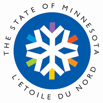
I quite like the rainbow snowflake, though that description sounds like something I’d be called online in 2016. “L’Étoile du Nord” is the state motto; “10,000 Lakes” appears on license plates but isn’t the official motto. Other things that aren’t the official motto include “It’s Freakin’ Cold” and “You Betcha!”
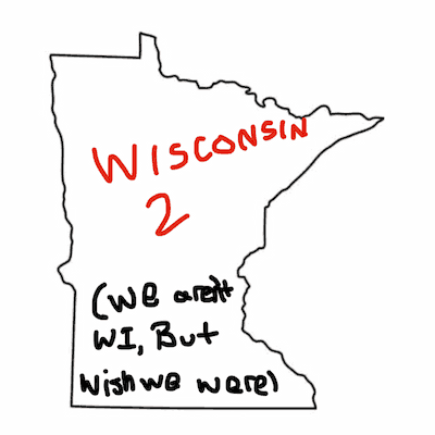
There’s a certain rivalry between Minnesota and Wisconsin. However, I’m unaware of any evidence that any Minnesotan wishes they were in Wisconsin.
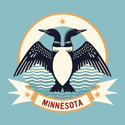
I pick that one as the clear winner for wit and artistic effort: mutating the heraldic two-headed eagle into a two-headed loon.
None of those won, of course. The chosen new seal shows a lake with wild rice growing, tall pine trees in the distance, the north star, and loon rampant to sinister (as they say in the heraldic trade). It also has “Mni Sóta Makoce” on it, the Dakota phrase that gave the state its name. Here’s the new seal:
I saw something saying the loon was supposed to be taking flight, but that’s not really how they take off, because they can barely fly. It looks to me more like a fierce, fighting loon.
Meanwhile in the flag contest, things got weirder, and I wished some of the designs had been posted with an explanation.

Presumably bigfoot would do his surfing on Lake Superior. (People do, even in winter.)

Is that a Feynman diagram of 𝛽 decay?
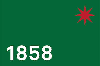
I’m a big fan of Peter Saville’s design work, but… no.

Is that Minnesota being used as a teabag in the lake?
(Update: Mystery solved thanks to a friend. It’s a fishing bobber. I think I failed to work it out because the line is totally straight and vertical. Or maybe I was terrible at fishing when I tried it. Or it could be that I make tea a lot more often than I’ve ever gone fishing.)
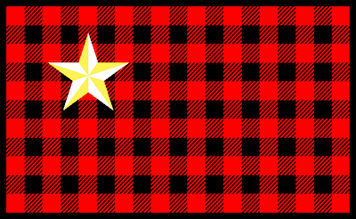
That’d probably a good flag for Northern Minnesota. There’s a joke that anyone who moves to Duluth gets issued a plaid shirt.
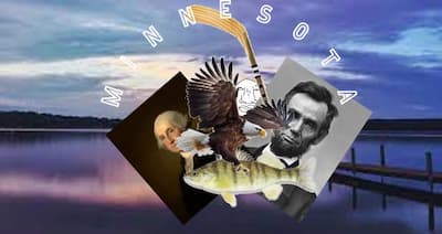
I’m not great at state history, but I don’t think Lincoln or Washington have any particular link to Minnesota? Probably nobody wants a flag with Jesse Ventura and Walter Mondale on it, though.

“OK kids, today in class we’re going to draw the state flag… No, please don’t cry…”

That one took me a long time to work out. It’s the Mississippi river, or at least the part of it that goes through Minnesota. (I’ve never been any good at geography.)

Also the Mississippi, plus the Minnesota and St Croix rivers.
As with the seal, loons made an appearance:

That loon is entirely too close for comfort.

Abstract or not, that is way too close. I think it’s the red eyes. Speaking of which…

Laser loon!
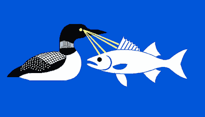
Laser loon shoots fish with its death stare!
Anyway, the submission chosen as the basis for the new flag was this one designed by Andrew Prekker:

The far right did their usual thing and came up with a conspiracy theory: that the flag was based on the flag of Puntland, Somalia, and was intended to represent Somalia’s having taken over Minnesota, in the guise of Ilhan Omar. (Factually speaking Ilhan Omar is from Mogadishu, which isn’t in Puntland; Minnesota is only home to just over 32,000 people born in Somalia, which is about 0.6% of the state’s population.)
Anyway, the final design was modified slightly and lost the stripes – which I’d thought were rather ugly, mostly because of the colors. Here’s the result:
The dark blue is roughly Minnesota shaped, the white north star is in the style of Indigenous art and mirrors the star seal in the rotunda of the Minnesota State Capitol, and the light blue right side symbolizes water.
Even without the stripes, the state’s Republicans are very angry about losing their flag of white supremacy, and of course they describe the new flag as an attempt to “erase our history”, as if museums can’t possibly find space for the old flag.
Vexilog… vexicollo… flag experts seem to like the new flag. I suspect it’s one of those cases of “Something has changed! Fetch the pitchforks!” where after a while most of the angry people will forget what they were angry about.