The Sony Ericsson P900
It’s commonly believed by folk in the US that the iPhone was utterly new and without precedent. I think it’s because before the iPhone, smartphones weren’t very popular in the US. Things were different elsewhere in the world, though. In 2005, I had a Sony Ericsson P900, a smartphone launched in 2003.
I found it in a closet the other day, and I couldn’t find many screen captures of the P900 software online, so I decided I’d take a few snapshots. Apologies for the quality, but I don’t have any actual screen capture software, so I just took photos with my current phone.
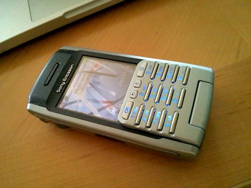
This is the exterior of the phone. It’s about the same size as an iPhone, but a bit thicker. As you can see, it has a physical keyboard. However, that flips down to reveal an iPhone-style rectangular touch screen. It’s a small screen, though: 65x42mm, so there’s a small stylus you can pull out and use for operating the smaller controls.
You can remove the physical keyboard entirely if you prefer.
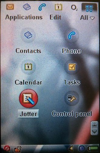
The home screen shows a grid of app icons. You can tap an app icon with your finger to open that app. Unlike the iPhone, however, scrolling is performed using the scroll wheel on the side of the phone, rather than by touching and dragging your finger. The latter would have required a capacitive touch screen to work well, and that technology wasn’t widely available in 2003.
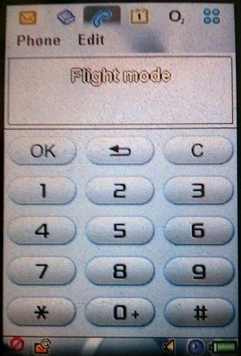
Here’s the phone dialer. Just like today’s smartphones, except the back and call buttons are at the top rather than the bottom.
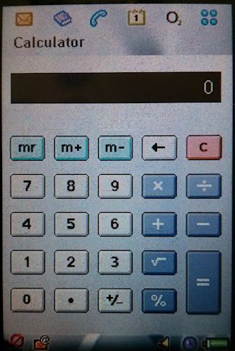
Similarly, here’s the calculator, which is entirely finger-operable.
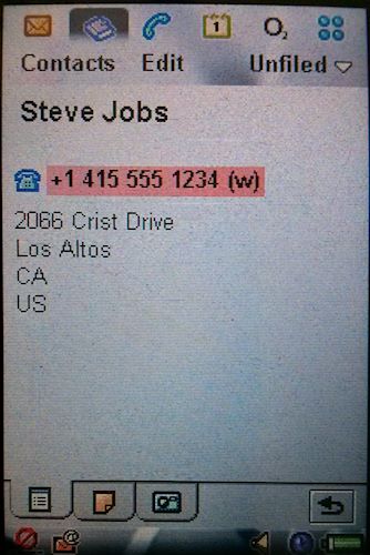
Here’s a card from the address book. The photo of the person is on a separate tab. Tapping the phone number calls that number.
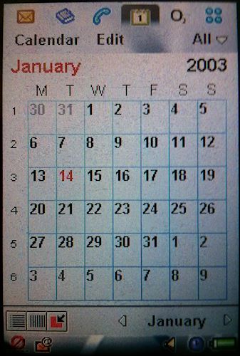
The obligatory calendar, with monthly, weekly and daily views.
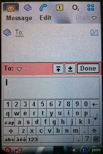
You thought pop-up keyboards were invented by Apple? Think again. This one is too small for finger usage, because of the screen size, but the principle is there. One curious decision is that the data entered is shown in an extra box above the keyboard, as well as in its proper place on the form screen.
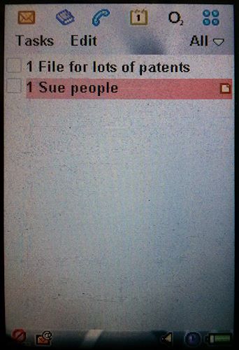
There’s a checklist app as standard, unlike with Android.
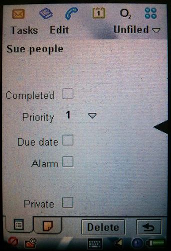
The checklist app is fairly sophisticated, and supports due dates and alarms.
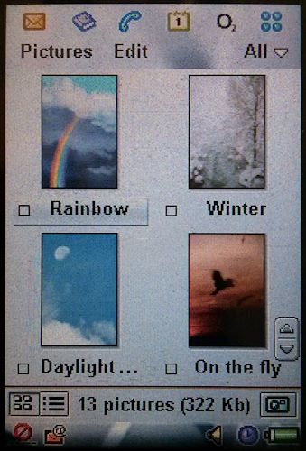
There’s an image browser for your photos.
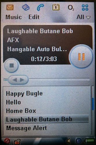
Also on the multimedia front, there’s an MP3 player app. It has rudimentary playlist support, but it’s no iTunes. Still, it understands ID3 tags.

Here’s some e-mail I got in 2005. Yes, Internet e-mail client with IMAP.
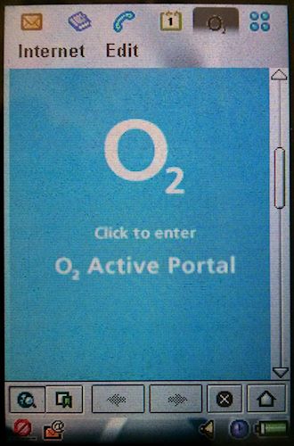
Obviously there’s a web browser as well.
Now, remember, this was on sale in 2003, some 4 years before the iPhone. Yes, there was a stylus to operate the small on-screen controls, but it’s pretty obvious that if you made the screen bigger and cleaned up a few design issues, you could operate it entirely by touching the screen.
The P900 supported third party apps too, written in Java or C++. You could download and install them via the web browser.
Let’s be clear about this: Apple did a fantastic job of taking existing smartphone UI ideas, and polishing them to perfection. But that’s the point — they built on other companies’ work, and copied a lot of things other companies had done first. They didn’t invent the entire design of the iPhone themselves, whatever Steve Jobs may have believed.